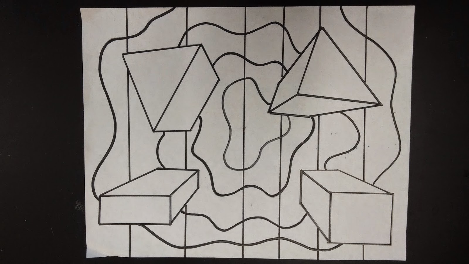
As students learned one point perspective, they experienced many options for their 3D shapes such as basic shapes, block letters, repeating shapes, and overlapping shapes. When designing and placing shapes, students were challenged to consider their composition and "balance" their shapes.
Once the 3D shapes were balanced, students then developed a background. Their background could have been anything from a realistic outdoor scene, to a decorative pattern.
Before coloring, students learned about color schemes. A color scheme is a way of organizing color. In the art world there are many color schemes that have specific names. Students learned about several color schemes: warm & cool colors, neutral colors, analogous colors, complementary colors, primary colors, and secondary colors. Students also had the option to use one color scheme on their 3D shapes, and a different color scheme in their background. Lastly, students could also use a "non-art" color scheme, something they could describe as easily recognizable from the world around them; like the colors for a well known sports team. Above, I have my example of MSU on the 3D shapes and U of M in the background.
Above is an example of a warm/cool color scheme.
Above is an example of a neutral color scheme.


