"Spring's Rebirth"

"Spring's Rebirth"
"Spring's Rebirth" 18"x30" Acrylic on Canvas 2016
Showing posts with label Art Lessons. Show all posts

Friday, January 27, 2017

Color & Emotion: Analogous color scheme painting

For this art piece, students were challenged to combine the use of color and imagery to express an emotion.  Students learned about the analogous color scheme, which is three colors in a row on the color wheel.  They discovered that when taking three colors in a row from the color wheel, they are often grouped together in ways that could show an emotion; for example blue, blue-violet, and violet would communicate sadness or red, re-orange, and orange would communicate anger.  Students then decided how to draw imagery to showed that emotion; either through illustration or through shape and design.  Once the imagery was drawn out, painting began.  Below is an example of a "happy" emotional painting using the analogous color scheme yellow-orange, yellow, and yellow-green.


The final stage was to retrace all the outlines and add a few details to the illustration.

Friday, December 9, 2016

Symmetrical Radial Color Wheel


For this assignment, 6th grade art students were challenged to first create a symmetrical radial design, then fill it in with the colors from the color wheel.

We began by learning how to make the design symmetrical.  This was accomplished by a series of folding, drawing lines with a black crayon, and then refolding and rubbing the lines from one area to another.  This process allows for the lines to be transferred exactly from one quadrant to another, and when repeated, keeps the design symmetrical.  It is also radial, because the design is based on a circle (though there are no actual circles in the design) and moves your eye in a circular eye path.

Then students studied the color wheel; reviewing primary and secondary color and adding knowledge of the tertiary/intermediate colors.  Over time students collaborated and learned the different mixtures to make all their own secondary colors (violet, green, orange) and their own tertiary/intermediate colors (yellow-orange, yellow-green, blue-green, blue-violet, red-violet, and 
red-orange) from the three primary colors yellow, red, and blue.

Students had the freedom to use the color wherever they wished in their design as long as they had all 12 colors from the color wheel someplace symmetrically in the design.  Students had a lot of fun creating these colorful and interesting paintings!

Friday, November 11, 2016

One Point Perspective 2016

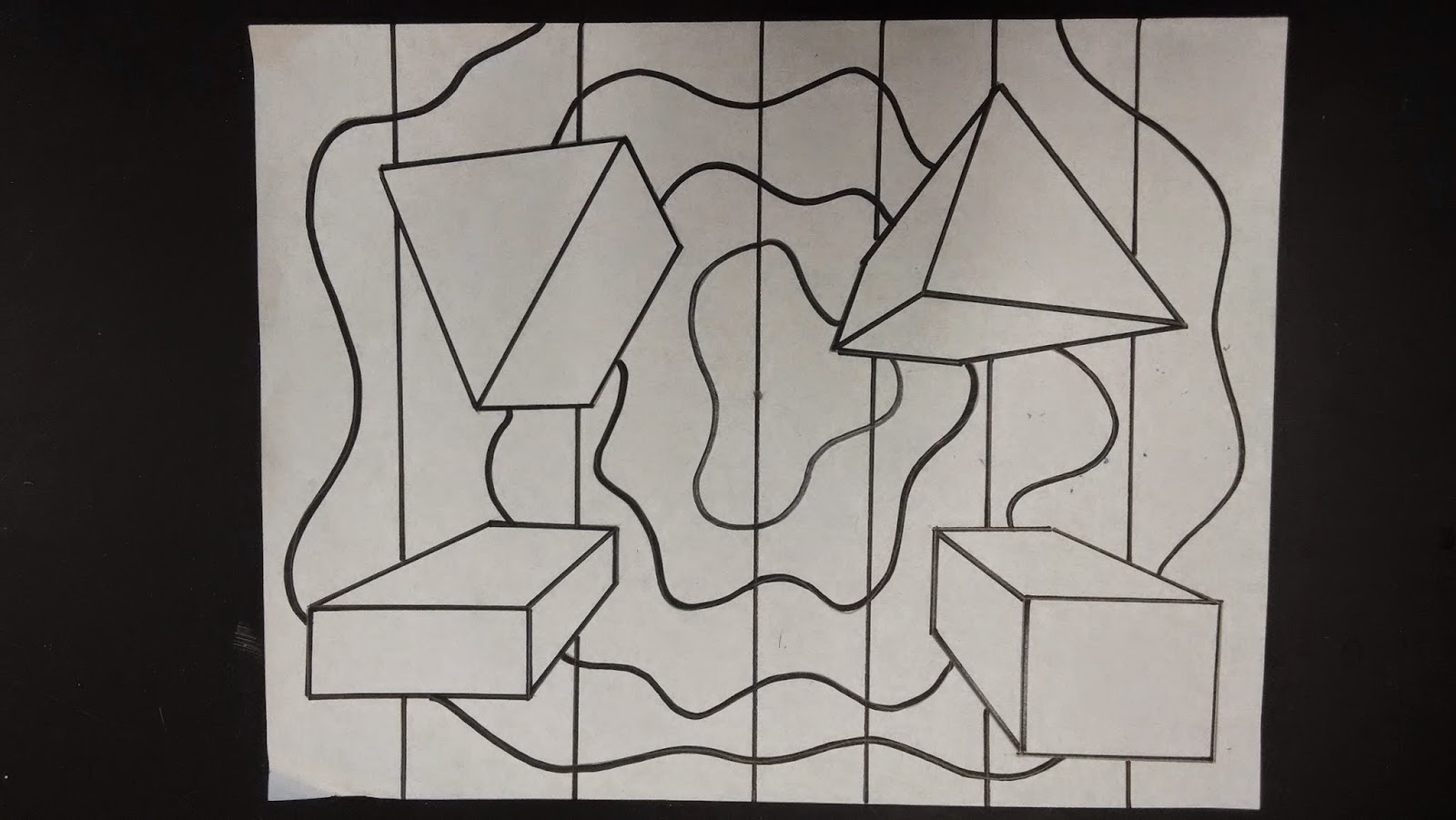
For this project students learned how to create the optical illusion of space/depth with the drawing technique of one point perspective.  As students learned one point perspective, they experienced many options for their 3-D shapes such as basic shapes, block letters, repeating shapes, and overlapping shapes.  When designing and placing shapes, students were challenged to consider their composition and "balance" their shapes around the page; making the whole page interesting and important, not just part of the page. 


 Once the 3D shapes were balanced, students then developed a background.  Their background could have been anything from a realistic outdoor scene, to a decorative pattern.


 Before coloring, students learned about color schemes.  A color scheme is a way of organizing color.  In the art world there are many color schemes that have specific names.  Students learned about several color schemes: warm & cool colors, neutral colors, complementary colors, primary colors, and secondary colors.  Students also had the option to use one color scheme on their 3-D shapes, and a different color scheme in their background.  Lastly, students could also use a "non-art" color scheme, something they could describe as easily recognizable from the world around them; like the colors for a well known sports team.  Above, I have my example of MSU on the 3-D shapes and U of M in the background.


Above is an example of a warm/cool color scheme.


Above is an example of a neutral color scheme.


This is an example of the complementary color scheme.


Tuesday, May 24, 2016

Cubist Self-Portraits

This year for a bit of Art History we studied Pablo Picasso and the art style he created, Cubism.  The main characteristics of Cubism are geometric lines and shapes with lots of overlapping.   There were two main phases of Cubism: Analytical and Synthetic. 

 We made these Cubist self-portraits mixed media to help the abstraction.  In each of these we used pencil, colored pencil, crayon, visual texture, markers, oil pastel, and collage.  There were several drawing techniques taught along the way such as a value fade with pencil, gradient color blend with colored pencil, texture rubbings with crayon, and gradient color blend with oil pastel.  I also gave students the option to use a color scheme to enhance their projects.

 In the earlier Analytical style of Cubism the person is broken up, analyzed, and reassembled abstractly; often past recognition.  This style has less color and more value.  The person and the background are treated the same, creating a very flat sense of space.
This is one of my Analytical Cubist examples with a traditional color scheme for this style; plus orange for fun!

In the later Synthetic style of Cubism the person is broken up and reassembled with simplified geometric shapes, generally in order of where they should be making the person easier to see.  This style is usually more colorful.  The background is usually treated differently than the person.
This is one of my Synthetic Cubist examples with an analogous color scheme of yellow, yellow-green, and green.

Thursday, March 31, 2016

Printmaking - An autobiography book cover 2016


For this project students were presented with an artistic challenge: 
"If you were the author/artist for your own autobiography, how would you design your book cover?"

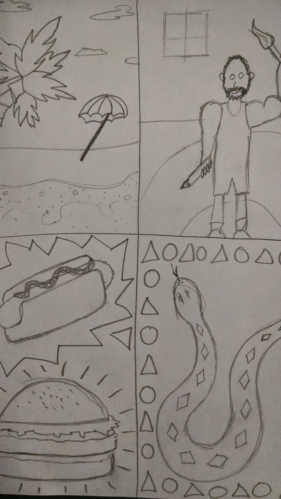
Students were encouraged to explore many avenues of their lives to include on their cover.  Common themes were: fond memories, favorite foods, music, sports, animals, family, the list goes on and on.  To begin, students were assigned to capture as many of their ideas quickly on paper by drawing smaller thumbnail sketches.


Once students developed and explored many ideas, they had to pick one idea or a combination of several ideas to use for their final design.  They then created "relief" by carving the design into the "block" or "plate."  In this case, we used flat pieces of Styrofoam (the example here has been printed many times which is why it looks so discolored).


Then students learned the process of printmaking to create their prints. 
The four most basic steps to create a good print are:
1. Load the brayer with ink
2. Apply the ink on the plate
3. Print onto paper
4. Label the print


 Students learned about the traditional ways to label their prints.  In the beginning stages of printmaking, the artist "proofs" their plate.  This is the process of creating several test or practice prints to make sure all the lines and shapes are printing how they want.  During this stage, changes can be made to the plate between proofs.  This is also a time to try out different colors.  Because of this "testing" time, those prints are labeled as a proof in the bottom left.  Then the artist traditionally signs their work on the bottom right.  You can also see how the image on the plate is different from the printed image, it prints as a mirror image opposite of each other.


Monday, February 29, 2016

Native American Indian Inspired Pinch Pots - 2016

To start, we began with raw white clay.  First we wedged the clay, which is the process of getting all the air bubbles out of the clay.  Next, we rolled it into a ball and we started a hole with our thumb and began pinching.  Pinching is a process; slowly rotating the pot in our hands while we pinch.


After we made the standard round pot shape, students had the option to "pinch" the pot into any other creative shape they wanted.  We discussed different possibilities for size, shape, and if we wanted the pinch pot to look like a new pot or an old artifact.  Students did a great job making theirs unique and interesting.


Next we carved traditional imagery into the wet clay.  Carving into the surface creates RELIEF.  We had many options for the relief such as: animals, symbols, patterns and natural elements.  Students could use one or all of these traditional themes.


Here you can see many student pots drying out before going into the kiln.


Then we glazed the pots using common earth tone colors from ancient tribes (red, brown, black white).  Glaze looks much different at first.  When we first put it on, it is nothing like how it will eventually look once it has been fired in the kiln.  At first glaze looks very dull, has a flat finish.  In the kiln, is goes through a chemical change (science!) where it melts, releases gasses, activates certain chemicals (don't worry, totally non-toxic), and then cools.  When we take them out of the kiln they look much different!!!


Here are a few examples of some of the finished glazes!


Tuesday, January 5, 2016

Radial Design Color Scheme Painting

For this painting, students first began with creating a symmetrical radial design.  Symmetrical mean it is the same on both sides, or in this case the same from side to side and from top to bottom.  Radial means it is based on a circle, and even though it is on square paper, the design moves your eye in a circular movement around the piece.

First, students folded their square paper in half (into a rectangle) and in half again (back to a smaller square).  From there students create four interesting (but not too complex) lines that will eventually become the entire design.  This is one quarter of the design.


 Then students folded the smaller square backwards and rubbed really hard.  This transfers the crayon lines faintly to the other small square.  Then they went through and retraced.  Now they have half of their design.


Then this process of folding and rubbing is repeated one more time, transferring one half to the other have, give the students their finished symmetrical radial design.


From there students had to select either an analogous or complementary color scheme to paint their design.  An analogous color scheme uses any three colors in a row on the color wheel (ex. yellow, yellow-green, and green).  A complementary color scheme uses two colors across from each other on the color wheel (ex. red/green, yellow/violet, or blue/orange).  Once painted, the final step was to retrace the outlines with black crayon one last time.
 The above example is an analogous color scheme painting using green, blue-green, and blue.  Notice the bottom half has been retraced, compared to the top half which has not.  There is am identifiable difference in the quality of the lines.

The above example is a complementary color scheme painting.  Complementary colors are called so because when placed next to each other, they make each other more intense and bold.  The opposite happens when they are mixed, they dull each others intensity.  If students selected this option, they would have had to mix them together at least once; in this example, they were mixed together in two different ways.  The lines in this example are also retraced completely.

Tuesday, December 1, 2015

Emotionally Charged Abstract Color Wheel

For the abstract color wheel assignment this year, we added a twist; while learning how to mix all the colors of the color wheel they also had to convey an emotion through the painting.  Students learned the emotional connect between colors and emotion, the main focus was on happy (yellow, yellow-orange, yellow-green), sad (blue, blue-violet, violet, blue-green, red-violet), and angry (red, red-orange, orange).  Students choose an emotion first and then depicted the emotion either through recognizable images, or as expressive design elements (shapes), or both.
 Example of an expressive design for angry.

 Example of a recognizable image for happy.


After the design was drawn out, students learned about the families of color on the color wheel (primary, secondary, and tertiary/intermediate).  Painting began with yellow, orange, yellow-orange, red-orange, and red.  The colors did not have to be in the correct order of the actual color wheel.  Students were challenged to think about the emotion they were trying to covey and to use those emotional colors predominantly to help express the emotion both through design and through color.
 Example of a happy expressive design after the first day of painting.


Next, students learned how to mix and used blue, green, blue-green, and yellow-green.
 Example of a sad expressive design after the second day of painting.


Last, students learned how to mix and use violet, red-violet, and blue-violet.
 Example of a finished angry abstracted color wheel.

 Example of a finished sad abstracted color wheel.

Example of a finished happy abstracted color wheel.

Tuesday, April 14, 2015

Printmaking: Autobiography Book Cover


For this project students were presented with an artistic challenge: "If you were the author and artist for your own autobiography, how would you design your book cover?"
 
Students were encouraged to explore many avenues of their lives to include on their cover.  Common themes were: fond memories, favorite foods, music, sports, animals, family, the list goes on and on.  To begin, students were assigned to capture as many of their ideas quickly on paper by drawing smaller thumbnail sketches.


Once students developed and explored many ideas, they had to pick one idea or a combination of several ideas to use for their final design.  They then created "relief" by carving the design into the "block" or "plate."  In this case, we used flat pieces of Styrofoam.
 
 
Then students learned the process of printmaking to create their prints. 
The four most basic steps to create a good print are:
1. Load the brayer with ink
2. Apply the ink on the plate
3. Print onto paper
4. Label the print
 Students learned about the traditional ways to label their prints.  In the beginning stages of printmaking, the artist "proofs" their plate.  This is the process of creating several test or practice prints to make sure all the lines and shapes are printing how they want.  During this stage, changes can be made to the plate between proofs.  This is also a time to try out different colors.  Because of this "testing" time, those prints are labeled as a proof in the bottom left.  Then the artist traditionally signs their work on the bottom right.

Monday, March 16, 2015

Native American Indian Inspired Pinch Pots

 We began with raw white clay.  Then we wedged the clay, which is the process of getting all the air bubbles out of the clay.  Then we rolled it into a ball.  Next we started a hole with our thumb and began pinching.


We then "pinched" it into the pot shape we wanted.  We discussed different possibilities for size, shape, and if we wanted the pinch pot to look like a new pot or an old artifact.


Next we carved traditional imagery into the wet clay.  Carving into the surface creates RELIEF.  We had many options for the relief such as: animals, symbols, patterns and natural elements.


Then we glazed the pots using common earth tone colors from ancient tribes (red, brown, black white).  Glaze looks much different at first.  When we first put it on, it is nothing like how it will eventually look once it has been fired in the kiln.  At first glaze looks very dull, has a flat finish.  In the kiln, is goes through a chemical change (science!) where it melts, releases gasses, activates certain chemicals (don't worry, totally non-toxic), and then cools.  When we take them out of the kiln it looks much different!!!


Here are a few examples of some of the finished glazes!


Tuesday, January 13, 2015

Radial Symmetrical Color Scheme Painting

 
We began by folding a square piece of paper into a rectangle, then back into a smaller square, and finally into a triangle.  Then the symmetrical radial design begins with drawing four basic lines with black crayon, not too complex but not too boring either, this is one eighth of the design.


Next we unfold the paper back to the smaller square and fold it backwards "smooshing" the crayon lines in the middle.  Then we rubbed a pencil very hard over the whole surface.  This transfers the crayon lines from the first triangle to the other.  To finish this step, we traced the faint lines with the crayon, now we have one quarter of the design completed.


Now we repeat this process of folding over and smooshing the crayon lines again.  This time from one quarter to another quarter.  After rubbing we retraced the faint lines again, now we have one half of the design.

To finish the design, we then folded it backwards one last time to transfer one half to the other half, giving us our completed radial symmetrical design.  Radial designs are based on the circle.  You can see, even though these are one a square piece of paper, it still very much has a circular eye movement to the design.  Creating the design in this way also allows us to create perfect symmetry.

Next, we selected a color scheme.  The choices were either analogous or complementary.  Above is an example of the complementary intensity color scheme.  Complementary colors are across from each other on the color wheel (red/green, orange/blue, yellow/violet).  For this color scheme, we could use the two colors on their own as well as mixing them together to get different intensities.
Above is an example of the analogous color scheme.  The analogous color scheme is three colors in a row on the color wheel, here we see blue, blue-green, and green.  This also demonstrates the final step which is to retrace the black outlines.  If you notice, the bottom has much darker solid black outlines.  Imagine how good these will look once they are finished!!!