"Spring's Rebirth"

"Spring's Rebirth"
"Spring's Rebirth" 18"x30" Acrylic on Canvas 2016

Monday, January 19, 2015

Featured Artists: Abstract Color Wheel 2015

 Samantha H.
 
 
 Alexa S.
 
 
 Kristi W.
 
 
 Kaitlyn O.
 
 
 Jessica G.
 
 
 Cole S.
 
 
 Mya S.
 
 
 Marion P.
 
 
 Kamryn R.
 
 
 Nessa G.
 
 
 Cassidy H.
 
 
 Elizabeth V.
 
 
 Elise V.
 
 
 Sarah B.
 
 
 Kayden W.
 
 
 Courtney C.
 
 
Holden R.
 
 
 Zuzu T.
 
 
 Ava O.


Sydney M.


Tuesday, January 13, 2015

Radial Symmetrical Color Scheme Painting

 
We began by folding a square piece of paper into a rectangle, then back into a smaller square, and finally into a triangle.  Then the symmetrical radial design begins with drawing four basic lines with black crayon, not too complex but not too boring either, this is one eighth of the design.


Next we unfold the paper back to the smaller square and fold it backwards "smooshing" the crayon lines in the middle.  Then we rubbed a pencil very hard over the whole surface.  This transfers the crayon lines from the first triangle to the other.  To finish this step, we traced the faint lines with the crayon, now we have one quarter of the design completed.


Now we repeat this process of folding over and smooshing the crayon lines again.  This time from one quarter to another quarter.  After rubbing we retraced the faint lines again, now we have one half of the design.

To finish the design, we then folded it backwards one last time to transfer one half to the other half, giving us our completed radial symmetrical design.  Radial designs are based on the circle.  You can see, even though these are one a square piece of paper, it still very much has a circular eye movement to the design.  Creating the design in this way also allows us to create perfect symmetry.

Next, we selected a color scheme.  The choices were either analogous or complementary.  Above is an example of the complementary intensity color scheme.  Complementary colors are across from each other on the color wheel (red/green, orange/blue, yellow/violet).  For this color scheme, we could use the two colors on their own as well as mixing them together to get different intensities.
Above is an example of the analogous color scheme.  The analogous color scheme is three colors in a row on the color wheel, here we see blue, blue-green, and green.  This also demonstrates the final step which is to retrace the black outlines.  If you notice, the bottom has much darker solid black outlines.  Imagine how good these will look once they are finished!!!

Friday, December 5, 2014

Featured Artists: one point perspective

Abby R.
 

Ainsley H.
 

Alleigh M.
 

Blake P.
 

Caden C.
 

Caiden K.
 

Ella S.
 

Emily P.
 

Faith W.
 

Hannah P.
 

Isabelle K.
 

Joshua G.
 

Kaitlyn R.
 

Madi M.
 

Megan S.
 

Morgan C.
 

Samuel N.
 

Shawn S.
 

Susie D.
 

William L.


Tuesday, December 2, 2014

Abstracted Coor Wheel 2015!

 To begin, students developed an original design using twelve shapes.  Next students learned about the color wheel: primary, secondary, and tertiary (intermediate) colors.  Then students spent several weeks learning how to mix the three secondary and six tertiary color themselves.  Once the paint was dry, students gave their painted shapes a sharpie black outline.
 
 Next, students then learned about value; how light or dark something is.  Shading with pencil is a common prior experience with value.  Here, students learned two new drawing techniques, hatching and cross-hatching to create value with pens and sharpie markers.  Spacing of the hatching lines is a huge factor in creating different values, the wider the spacing the lighter the value, the closer the spacing gets the darker the value.
 
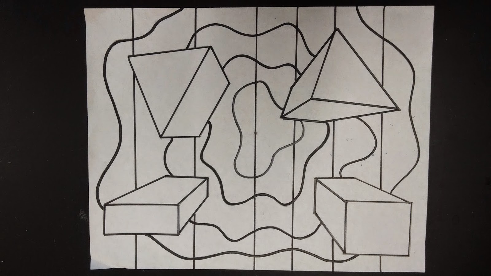
 Students then divided the background up into shapes.
 
 Next, to create a sense of contrast, students began applying the hatching in the background.
 
To finish, students were challenged to create a variety of values: light, medium, and dark.  As always, students were also challenged to consider their composition and to balance the values evenly around the background.

Friday, October 24, 2014

One Point Perspective 2014

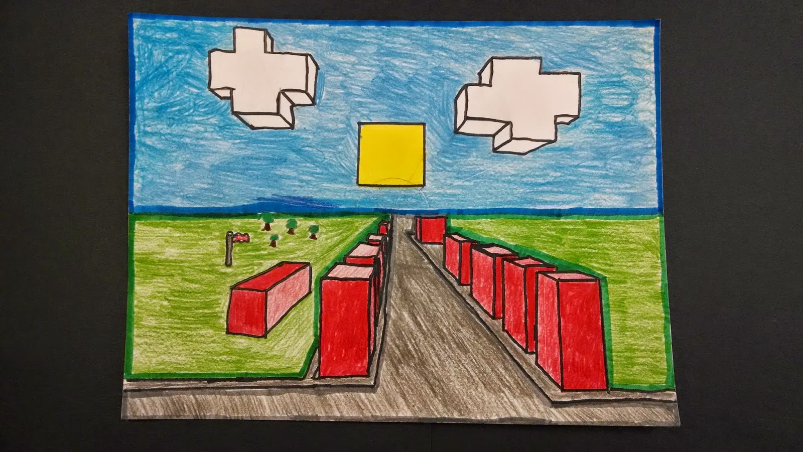
As students learned one point perspective, they experienced many options for their 3D shapes such as basic shapes, block letters, repeating shapes, and overlapping shapes.  When designing and placing shapes, students were challenged to consider their composition and "balance" their shapes.
 
 Once the 3D shapes were balanced, students then developed a background.  Their background could have been anything from a realistic outdoor scene, to a decorative pattern.
 
 Before coloring, students learned about color schemes.  A color scheme is a way of organizing color.  In the art world there are many color schemes that have specific names.  Students learned about several color schemes: warm & cool colors, neutral colors, analogous colors, complementary colors, primary colors, and secondary colors.  Students also had the option to use one color scheme on their 3D shapes, and a different color scheme in their background.  Lastly, students could also use a "non-art" color scheme, something they could describe as easily recognizable from the world around them; like the colors for a well known sports team.  Above, I have my example of MSU on the 3D shapes and U of M in the background.

Above is an example of a warm/cool color scheme.
 
Above is an example of a neutral color scheme.