"Spring's Rebirth"

"Spring's Rebirth"
"Spring's Rebirth" 18"x30" Acrylic on Canvas 2016

Tuesday, April 14, 2015

Printmaking: Autobiography Book Cover


For this project students were presented with an artistic challenge: "If you were the author and artist for your own autobiography, how would you design your book cover?"
 
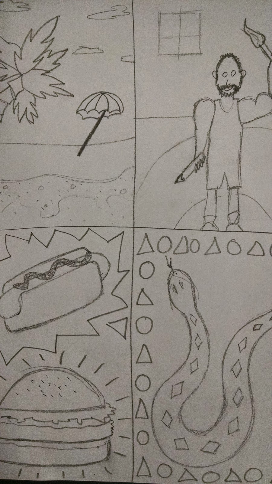
Students were encouraged to explore many avenues of their lives to include on their cover.  Common themes were: fond memories, favorite foods, music, sports, animals, family, the list goes on and on.  To begin, students were assigned to capture as many of their ideas quickly on paper by drawing smaller thumbnail sketches.


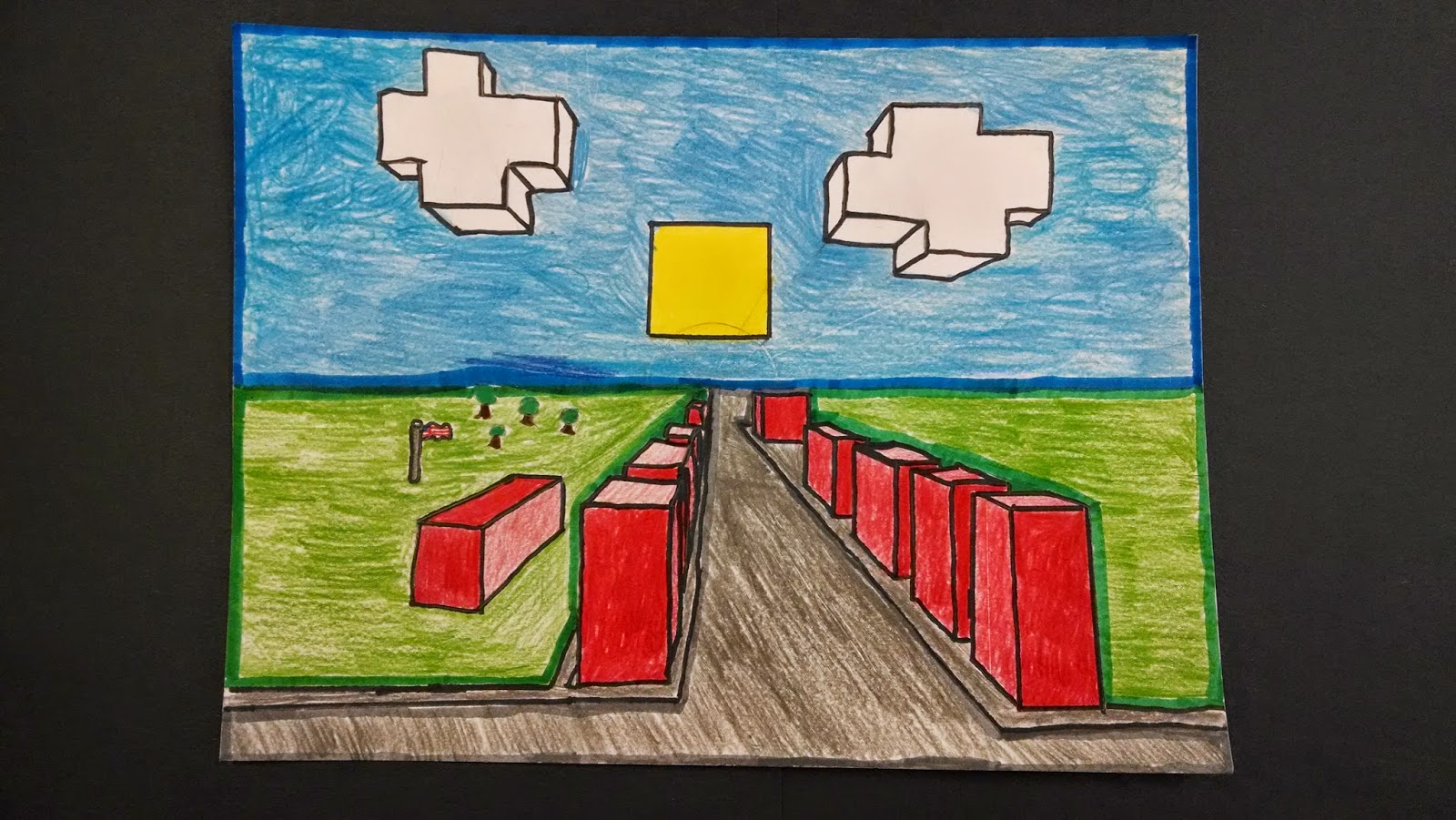
Once students developed and explored many ideas, they had to pick one idea or a combination of several ideas to use for their final design.  They then created "relief" by carving the design into the "block" or "plate."  In this case, we used flat pieces of Styrofoam.
 
 
Then students learned the process of printmaking to create their prints. 
The four most basic steps to create a good print are:
1. Load the brayer with ink
2. Apply the ink on the plate
3. Print onto paper
4. Label the print
 Students learned about the traditional ways to label their prints.  In the beginning stages of printmaking, the artist "proofs" their plate.  This is the process of creating several test or practice prints to make sure all the lines and shapes are printing how they want.  During this stage, changes can be made to the plate between proofs.  This is also a time to try out different colors.  Because of this "testing" time, those prints are labeled as a proof in the bottom left.  Then the artist traditionally signs their work on the bottom right.

Monday, March 16, 2015

Featured Artists: Radial Color Scheme Painting

Nina M.
 

Tate G.
 

Elise M.
 

Sam J.
 

Xander A.
 

Sophia A.
 

Maryn T.
 

Alayna W.
 

Hailey M.
 

Mishka W.


Native American Indian Inspired Pinch Pots

 We began with raw white clay.  Then we wedged the clay, which is the process of getting all the air bubbles out of the clay.  Then we rolled it into a ball.  Next we started a hole with our thumb and began pinching.


We then "pinched" it into the pot shape we wanted.  We discussed different possibilities for size, shape, and if we wanted the pinch pot to look like a new pot or an old artifact.


Next we carved traditional imagery into the wet clay.  Carving into the surface creates RELIEF.  We had many options for the relief such as: animals, symbols, patterns and natural elements.


Then we glazed the pots using common earth tone colors from ancient tribes (red, brown, black white).  Glaze looks much different at first.  When we first put it on, it is nothing like how it will eventually look once it has been fired in the kiln.  At first glaze looks very dull, has a flat finish.  In the kiln, is goes through a chemical change (science!) where it melts, releases gasses, activates certain chemicals (don't worry, totally non-toxic), and then cools.  When we take them out of the kiln it looks much different!!!


Here are a few examples of some of the finished glazes!


Monday, January 19, 2015

Featured Artists: Abstract Color Wheel 2015

 Samantha H.
 
 
 Alexa S.
 
 
 Kristi W.
 
 
 Kaitlyn O.
 
 
 Jessica G.
 
 
 Cole S.
 
 
 Mya S.
 
 
 Marion P.
 
 
 Kamryn R.
 
 
 Nessa G.
 
 
 Cassidy H.
 
 
 Elizabeth V.
 
 
 Elise V.
 
 
 Sarah B.
 
 
 Kayden W.
 
 
 Courtney C.
 
 
Holden R.
 
 
 Zuzu T.
 
 
 Ava O.


Sydney M.


Tuesday, January 13, 2015

Radial Symmetrical Color Scheme Painting

 
We began by folding a square piece of paper into a rectangle, then back into a smaller square, and finally into a triangle.  Then the symmetrical radial design begins with drawing four basic lines with black crayon, not too complex but not too boring either, this is one eighth of the design.


Next we unfold the paper back to the smaller square and fold it backwards "smooshing" the crayon lines in the middle.  Then we rubbed a pencil very hard over the whole surface.  This transfers the crayon lines from the first triangle to the other.  To finish this step, we traced the faint lines with the crayon, now we have one quarter of the design completed.


Now we repeat this process of folding over and smooshing the crayon lines again.  This time from one quarter to another quarter.  After rubbing we retraced the faint lines again, now we have one half of the design.

To finish the design, we then folded it backwards one last time to transfer one half to the other half, giving us our completed radial symmetrical design.  Radial designs are based on the circle.  You can see, even though these are one a square piece of paper, it still very much has a circular eye movement to the design.  Creating the design in this way also allows us to create perfect symmetry.

Next, we selected a color scheme.  The choices were either analogous or complementary.  Above is an example of the complementary intensity color scheme.  Complementary colors are across from each other on the color wheel (red/green, orange/blue, yellow/violet).  For this color scheme, we could use the two colors on their own as well as mixing them together to get different intensities.
Above is an example of the analogous color scheme.  The analogous color scheme is three colors in a row on the color wheel, here we see blue, blue-green, and green.  This also demonstrates the final step which is to retrace the black outlines.  If you notice, the bottom has much darker solid black outlines.  Imagine how good these will look once they are finished!!!

Friday, December 5, 2014

Featured Artists: one point perspective

Abby R.
 

Ainsley H.
 

Alleigh M.
 

Blake P.
 

Caden C.
 

Caiden K.
 

Ella S.
 

Emily P.
 

Faith W.
 

Hannah P.
 

Isabelle K.
 

Joshua G.
 

Kaitlyn R.
 

Madi M.
 

Megan S.
 

Morgan C.
 

Samuel N.
 

Shawn S.
 

Susie D.
 

William L.